Creating & Maintaining Impactful Dashboards Part One
The earlier blog post Who Needs Dashboards? explored different types of dashboard in a business and why dashboarding is important. It also explored how dashboarding increases transparency and communication in a business, and the benefits of this.
This series of posts will cover some hints and tips on how to ensure the dashboards you create are easy to maintain and suitable for their purpose.
What is a dashboard again?
Dashboards are also known as visualisations. They are used to display information that is useful in a way that is easy to understand and react to. There are quite a few examples of dashboards that are used day-to-day outside of technology.
An example of an everyday dashboard is a dashboard in a car. There are a few different ways that information is conveyed on a car dashboard. The information that you need the most - how fast you are going and how much fuel is in the tank - is most readily available. This information is normally shown, ever-present, on big dials that are easy to see and read.
A driver would also need to be alerted if there was something wrong with their car that they may need to act on - the oil needs changing or there is a problem with the engine. These will also appear on a dashboard but in a different way to the information that is needed all the time. This is so that attention is drawn to it, that the driver knows it is more urgent. Some cars may show them as a specially shaped light that flashes up when there is a problem. For less urgent alerts, they may show up in a different colour or format. Examples are that the cars indicator lights or fog lights are on.
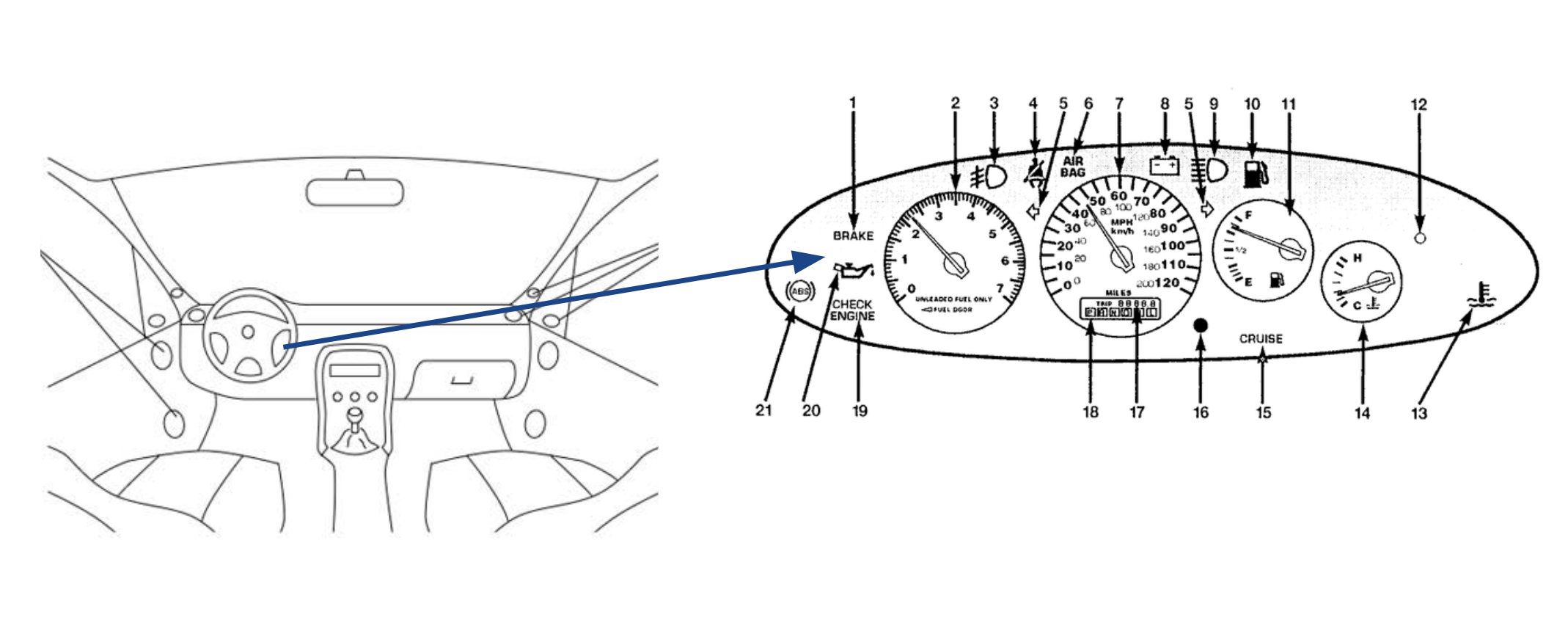
Dashboards are used in very much the same way when covering projects, initiatives and systems. A good dashboard should be easy to read and react to. The information you need on a regular basis should be easy to identify, but if something is abnormal and needs to be reacted to urgently, it should attract the attention of those that need to react to it.
How come my dashboards aren’t as useful as the one in my car?!
It’s simple - dashboarding is a difficult thing to do well. There are many ways in which things can go astray. This series of posts will cover some ways in which you can determine what should and shouldn’t be on a dashboard. This post will explore some of the conversations and considerations when gathering requirements and creating dashboards. Following posts will cover maintenance and working with established dashboards.
Talking to stakeholders.
Previously when trying to find out what needed to go on a dashboard, I would ask the stakeholders of the feature or project what they wanted or needed to see on a dashboard. Though the intentions were right, this would lead to metrics that weren’t useful and dashboards that were largely ignored. If they had metrics that were more useful or clear, a few problems may have been averted or spotted earlier.
Talking to the stakeholders was the right thing to do, but the questions needed framing in a different way. It’s often easy to think of what we want but it takes a lot of thought to determine what we need and often, we only find out what we need through experience.
These conversations are lead by the type of dashboards that are being created and their purpose.
High level business intelligence or management information dashboards
These dashes are to aid and monitor strategic or tactical goals within a business. As such we want to cover the objectives of these initiatives and whether there are problems that may need early intervention.
Some of the questions you may ask your stakeholder(s) for these dashboards include:
- What are the company objectives?
If this is a Business Intelligence (BI) style dashboard those using it are going to be primarily concerned with how well the business is meeting the goals as agreed by investors, upper management and directors. These metrics will be used to aid decisions about the focuses of the company, how they can progress, grow and stay afloat. By determining what the company objectives are that need to be monitored, we can determine what success would look like, and the elements that might be a risk to these objectives.
Management Information (MI) have projects aiding in the success of these overall objectives. Again by knowing which company objective these initiatives are targeted at aiding, we can measure to determine the effect its having on the overall company objective.
- What are the KPIs of your project
KPI is an acronym that stands for Key Performance Indicator. Most company plans and objectives will have KPIs associated with them. Again by having measurements associated with these, the success of the initiatives can be monitored as well as their progress. If it doesn’t look like a KPI is going to be met, reactive measures can be taken.
- How might this initiative fail?
This is the trickiest one to broach out of the three, but is useful for pretty much every dashboard you will create. Much like with our car dashboard - we want to know when something is failing, especially if we might have something we can do about it or measures to take to minimise the impact of the damage.
No one likes to think about failure, but no one is going to be more aware of the ways the focus of your attention may fail than the experts of the domain. Much like the car manufacturer who designed and built the car you are driving have thought about the failures a car may have and put in alerts around that, those working directly with or a domain / system or that have thought of an initiative will probably have a better idea of possible failures.
Execution dashboards (operations/development)
A lot of the questions will be similar. If you work in a development team that works closely to product for example, you may be building features for MI objectives, and therefore will be wanting to know that feature is meeting the needs of that project.
There are many cases where execution dashboards differ however. Here are just a few of the questions you might want to ask the stakeholder when gathering requirements for your dashboards.
- How do you know an app / feature is working?
This might seem like an obvious question, but the answers may not be what you expect. Rather than “you can reach the webpage”, success might be that the feature can accept a certain load or have a certain response time. It might be a security concern - the app or feature might want to be only accessible from certain places. Find out what success should look like. This will not only help you know the requirements for what your monitoring, but may even provide some test cases or requirements you didn’t know about.
- What are the KPIs / SLAs?
Back to Key Performance indicators! These might not be apparent from the “what success looks like” conversation. Further to this, there may be separate KPIs that need to be considered at this level.
SLAs are Service Level Agreements. They may be determined by internal or external relationships. It’s a contract for how your app / feature / system / hosting etc. is expected to perform outwardly. You may have an obligation to only have a certain amount of downtime, or to a certain response time for example. Breaking SLAs is not only a problem for reputation, but it can have a financial impact as well, be it through fines or losing partners.
As part of this you may want to find out who should be informed if these KPIs aren’t met or SLAs are broken. Also, what action should be taken, if any. What is the impact?
- What are the base metrics we would normally use for this?
There will always be some standard metrics you will want to cover as part of execution dashboarding. It might be that you use R.E.D for your APIs for U.S.E for your services. It might be the Four Golden Signals from the Google SRE book. There will be standard metrics that you normally have to ensure that your environment is working as expected. Just remember to keep them useful - not interesting. (Though I think useful metrics ARE interesting as well as informative).
This does not even nearly cover all the questions you may want to cover with your stakeholders but it gives you an idea. The other thing to be careful to be of is the answers to these questions. Make sure that they are measurable. “The user interface needs to be responsive” or “responses from the API need to be fast” are not quantifiable. Ensure that you can get requirements that you can monitor, measure and know you have met.
You need to have the context of why things are measured, how they might be reacted to and how long they need to be measured for. This brings me nicely onto the next section.
Requirement gathering and pushing back.
There are going to many points in the creation and maintenance of your dashboards where people will be making suggestions about what should be on them. It might be in the initial conversation with your stakeholders, it may be in a passing comment or it may be a requirement added later on.
When having these conversations, there is one rule I stick to. While maintaining a degree of professionalism - channel your inner toddler.
We all know that annoying adorable phase all kids go through when they are curious about everything in the world. They want to know why, when, what, who and then they might go back to why and the cycle continues. If we channel our inner toddlers and revert back to this tendency - we can keep our dashboards beautiful, clean and useful.
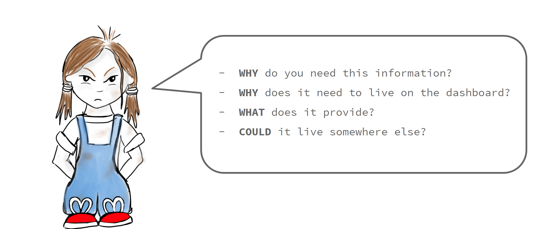
- WHY do you need this information?
- WHO is it for / needs this information?
- WHAT does it provide? Is it measuring anything that we need to track based on the previous conversations we have with our stakeholders around KPIs? Is it a new concern or requirement?
- HOW long is it needed for?
- WHY does it need to live on the dashboard?
- COULD it live somewhere else?
Yes, there are a lot of things that “might be interesting” and that is great - but there needs to be an element of purpose to our measurements. If there aren’t we end up with over-crowded, uninformative and confusing dashboards where we don’t know which metrics we need to react to and which are interesting. It leads to dashboards which are hard to use and that inevitably end up neglected or we end up missing information that really needed reacting to.
I’m probably not hiding the pain that I’ve felt from “because it’s just interesting” metrics ending up on dashboards that I’ve been responsible for in the past.
The last question of “could it live somewhere else” is quite an interesting one. If the information / data is needed for a long term goal or cannot be actioned upon quickly, it probably shouldn’t be on a dashboard (there are some exceptions to this rule for operational or development dashes). Maybe it should be in a store, or in logs to be later interpreted with a log analytics tool. If the person needing the information needs to do calculations or models based on the raw data for instance, the data will definitely need to be stored separate from the dashboard. Maybe in a data store or spreadsheet.
Have a purpose for your dashboards, and a reason to react for the metrics on them. By channelling your inner toddler and ensuring these things, you will have metrics you can react to in an effective manner and dashboards that are much easier to work with.
Putting in baselines / benchmarks
Where applicable - get your monitoring in early and measure your baselines / benchmarks. If you determine the current behaviour of the system, application or feature - you will be able to see the affects of your efforts.
Without knowing what is normal, you won’t know if any changes you see are better, worse or the same. You won’t truly know if you should be reacting to them, let alone how.
You have gathered the requirements and figured out roughly what measurements and metrics are going to be important for your dashboards. Get them in and start measuring them.
Picking which tools you should use.
The importance of communication in the creation of dashboards and visualisations cannot be understated. Picking the tools to create and maintain these now stunning dashboards can also be a challenge.
There isn’t one perfect tool that is going to solve all your problems
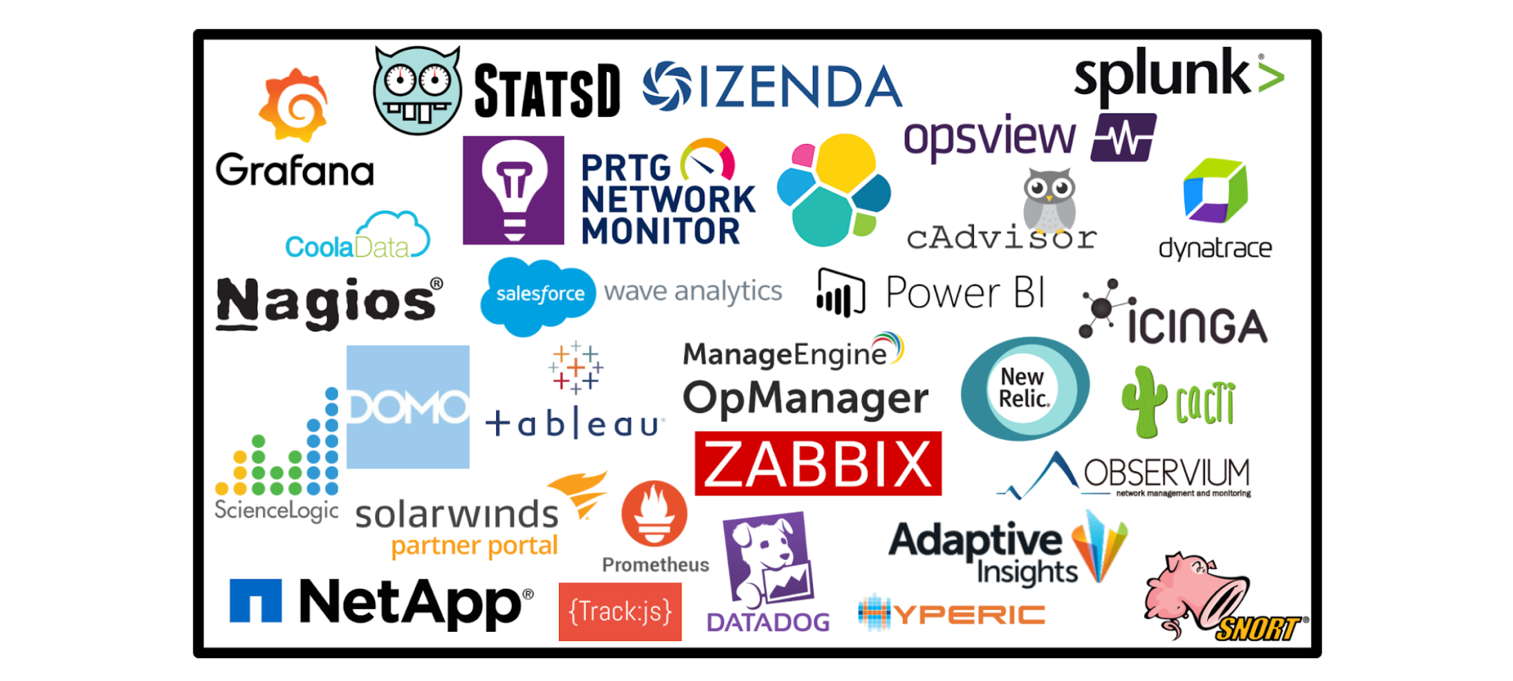
There are many tools out there, each with their own main focus or specialism. There are differences between tools that specialise in metrics (for example DataDog) and those that are used for log analytics (an example is Kibana). Some tools will specialise in a certain type of monitoring such as Tableau which is aimed at analysing BI data opposed to Zabbix which is more suited for operational data. There are some that are more cross-functional as well.
To know which one is suitable for your needs at the time often requires research and a building a business case. If you end up using multiple tools - that is ok! There is nothing wrong with that! As long as using multiple tools is suitable for your needs.
Next I will go through some areas that you might consider covering as part of your business cases for what monitoring tools to use.
User / Development concerns
- Is it for a particular type of monitoring?
Going back to what was just mentioned, these tools can have specialisms. If you are wanting to do tracing, debugging and be actively using the tool for fixing issues - you might want to use a tool that’s particularly good at log analytics. If you are wanting to see how an API or a service is behaving or want to see how many people are using a feature of your website, look at a tool suitable for those measurements. If it is for use by higher management - you might want to look at different tooling again. You aren’t going to be short on choice no matter the purpose.
- Does it need to be accessible?
By accessible I mean, do you want the dashboards to be shareable? Do you want people to have to log in to see the details on your dashboards? Do you want them to be openly accessible but only show certain periods of time? Are these things offered as part of the tooling’s features?
- What data sources does it support?
Data sources are where your data is coming from that these metrics are using for their calculations. It could be an excel sheet, a messaging queue, a database… there are a lot of options. Does it support the data sources that you want to be building your metrics off / against?
- Can the tool cover the type of queries you will be most commonly using?
Whether it the average journey of a customer through your app or how long it takes for your API to respond to a request - if your most common queries can’t be covered by the tool under consideration, it’s probably not worth considering.
- Does you team have experience / how steep is the learning curve/ are the learning resources good
It takes a lot of time to train a team on a new tool. Even having one or two people that have hardened experience using a tool can help it’s adoption. Not only this, but it can be a god-send when things don’t behave exactly as expected.
If the tools that the team are using aren’t fit for purpose, or there isn’t something in place, consider the training materials. Does is have a few ways in which people can learn the tool? Is the documentation up to date? Is there support available for the tool if its needed, and how much does that cost? Try to ensure that the on-boarding is going to be as easy and supported as possible.
- Does it need support from a development team?
This is part of the previous point, but consider your user. If the person using the tool isn’t used to building dashboards using JSON, maybe consider a tool that has a “drag and drop” UI that is more suitable for them. Consider the user and the audience.
Cost and Hosting
- What’s the budget?
If you can’t afford what you are looking at - you probably shouldn’t use it, right?
- Do you want to self host or have hosting provided?
This may sound like an implementation detail but it will affect cost and considerations for future maintenance.
Other features
- Does it support alerting in a way that’s useful to you?
Dashboarding isn’t the only use of monitoring tools. If you plan to alert using the tool as well, look at what integrations it supports. Some have options for SMS alerting or Slack for example. Others will only provide you with a webhook and expect you to hand roll an alerting system.
Treat it like Blind Date. If there is a tool that is answering all your questions with what you want to hear - they are probably worth choosing. Again, the above doesn’t necessarily cover all the bases. There will be other questions that are company or project specific, or that I have just not thought about or forgotten about at the point in time that I have written this post. This is just a starter-for-ten to help.
Next Time On Impactful Dashboarding…
There is a Part Two of this series currently in progress. In this post we have covered a lot about the creation of dashboards. The next post will explore maintenance of dashboards. How to tell if your dashboards might need a bit of a rework or refresh and how to approach those problems.
Until next time.
J.