Creating & Maintaining Impactful Dashboards Part Two
In Part One of this series of posts creation of impactful dashboards we covered what a dashboard is, and some tips on what to do when thinking about creating a dashboard.
In this section, we are going to cover maintenance of dashboards. Some suggestions on how to keep dashboards useful, and some considerations when working with them.
Lifetimes
Many different things involve monitoring from the type we see working with technology, to the good ol’ car dash. For the use cases covered in these posts, businesses and systems are monitored. Businesses and systems evolve over time. They need to adapt and grow in order to be successful. The dashboards used to monitor them also need to evolve to stay valid. As the situations and priorities change, we need to adapt our measurements.

There are numerous situations in which dashboards will need to be edited, created or deleted:
Short term dashboards.
A few examples of when short dashboards might be needed include live tests, proof of concepts or for short lived tactical projects. There are a number of reasons why some tactical projects may be short term. For instance, there may be advertising schemes that are centred around a particular event. You may have a football related advert during a world cup for example or, a valentines focused advert. If you know how long an initiative is going to be active for, it’s most likely you will need a short term dashboard.
We will want to know the impact of these projects or tests to see if they were effective, if there is anything we can learn from them or if we should create a full, long lasting version of them. When creating these kinds of dashboards there are a few extra requirements you need to gather. In the post covering the ‘creation of impactful dashboards’ we covered that we need to determine what success and failure looks like and measure the baseline before measuring the change. For short term goals we also need to know at which point this iteration of the project will be considered “finished”. For a dashboard based off a tactical project this will be relatively easy to determine - it’s when the advert goes offline or the date we no longer want to offer that feature. It needs to be a definite date where we can revisit if the dashboard is going to be of use anymore.
For proof of concepts and tests, this conversation may be a little harder. It may be that the person leading the test is also managing the dashboard. As such, they may be invested in it’s success and struggle setting a deadline in which success or failure is determined.A date needs to be determined to revisit the effectiveness and the future direction of the test based on what has been observed.
If it was effective, then make plans on how to make the test suitable for long term use. No matter if its a management information test or a execution level of test, in order to keep it around if it’s successful, there will need to be a level of rethought. Are there any journeys or code that need deprecating and deleting? Does anything need to be changed to keep it maintainable in the future? Once this is determined, you then need to re-assess or delete the dashboards covering the test. If it was successful, the dashboards will need to evolve with the implementation of the full version of the test to remain relevant. If it was unsuccessful, the dashboard is no longer useful and can be removed.
Long term projects
A team I used to work in did feature work. We implemented new innovations, edited existing functionality and occasionally deleted parts of the system that were no longer required. Whenever we started work on an area we would display the execution dashboards covering the areas of the system that were being impacted by the changes we were making on the screens near our desks. Sometimes we would also show the boards the stakeholders of the project would be observing as well.
As we were doing the work, we edited these dashboards. Removed anything that was no longer relevant, edited what was being measured, adding new measurements. If the area these dashes were measuring were changing or evolving, it made sense that the measurements of them should be changing too. As was stated before, software systems and businesses evolve, so should the dashboards that represent them.
Deletion as part of maintenance
Both long and short term monitoring will involve deletion. This does not just occur because a “lifetime” has reached it’s end, but also to remove stale data. This is part of the evolution of both long and short term dashboards. As was stated in the previous post, we only need metrics we can react to and that are useful to us.
An example of this is if you have been monitoring a certain type of error, which a fix has been implemented for and it has been stable for a few weeks. You probably should remove that visualisation from the relevant dashboard or the alert covering it for example. Don’t keep metrics that you can no longer respond to or have a use for.
De-prioritisation as part of maintenance
Lifetimes don’t just cover deletion. Sometimes a dashboard might be de-prioritised. For example, if it is a feature level dashboard and the product has been stable for weeks. In this case the dashboards will be kept somewhere accessible, as they will be needed again, but not left in a prominent place. Higher priority boards would be displayed in their stead.
The team I mentioned earlier had a screen next to where we worked. Whenever we were working on a part of the system, we would bring up the boards covering that part of the system on that screen. While we were working on it, and for two weeks after completion of each project, we would keep those dashboards on the screen. While we were doing development in these areas, there was a chance that mistakes could be made so it was not considered to be in a “stable” state. Sometimes is takes a bit of time for us to see impact or problems after a project was finished. Hence a arbitrary two week period for dashboards to stay in our ‘line of site’ was was chosen. Once this time had passed, the dashboards for the next project would become our primary dashboards and the ones taken on the screen were still kept in the tool we were using for later access.
There are a few reasons we chose to do this:
-
There were a lot of dashboards and not all of them could be displayed. We needed a way of just showing thing which were most likely to be less stable during a period of time.
-
Even if you can display a lot of your boards, if you are not actively using the metrics on the majority of what is being displayed, they can become part of the scenery and ignored.
-
As we sat near to some of our stakeholders, we could show them what we expected from the boards and why. This meant they tended to also actively look at the boards while projects they were interested in were being worked on.
-
We could easily spot trends we might need to act on that had been triggered by our actions. You can’t alert on behaviour you haven’t predicted.
This is mostly for execution style dashboards. From what I have experienced management information dashboards and business intelligence dashboards only get put on display during meetings or audits. It may apply to these styles too though in some circumstances.
If you are showing boards at a “project” or “feature” level on your visible screens, the next section can be particularly advantageous.
Layers
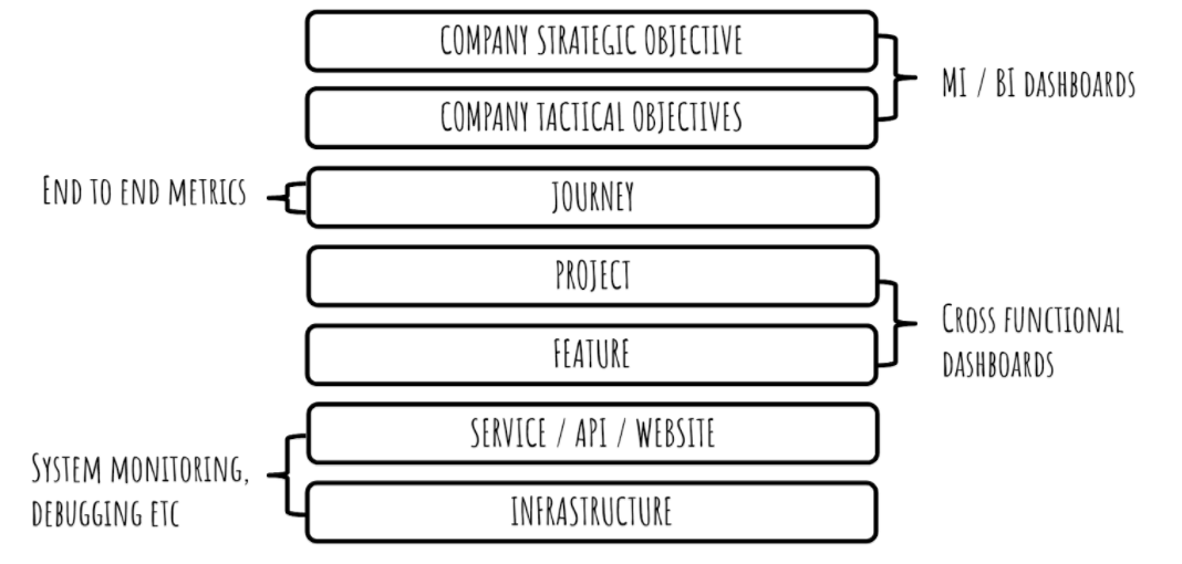
The different types of dashboard correspond to different layers in a system. As was just covered, the layer a dashboard may cover can affect peoples exposure to and use of it. Not all layers of dashboard will be visible to the same person / group of people and not all would be displayed at once.
The MI and BI dashboards cover company objectives. The BI dashboards will be used by upper management when they are needed, and a combination of MI and BI may be displayed to show company progress to a quarterly goal. Away from this, it is unlikely these would be displayed on a screen in the office.
It’s possible dashes relating to tactical objectives would be displayed in the office while they were being carried out. This would be so that the stakeholders and those involved in the work for these projects can see their effectiveness and progress.
Some tooling can allow clicking through these layers. For example, by seeing some odd behaviour on a metric about a project or feature, you could click on it to be directed to a relevant development or operations dashboard covering the area of the system related to the area that is behaving strangely. This is incredibly useful for debugging or tracing when an issue occurs.
Each layer has its own purpose or use, but the layers all interact and have an effect on each other. It’s part of the reason transparency and communication is key. Dashboards help with this, demonstrating information in an easy to understand (or at least explain).
Overview
In this section we covered some of the ongoing concerns when maintaining dashboards. We discussed that dashboards should evolve alongside what they are measuring and that when an expectation or behaviour changes, the dashboards relating to it should also be edited. We covered some of the different “layers” of dashboards and when they should be readily available and present in a line of site.
Again these are just high level suggestions on ways to work and interact with your dashboards when maintaining them to ensure that they remain useful.
Next Time On Impactful Dashboarding…
The next section of this series will cover ‘danger signs and don’ts’ of dashboarding. How to tell when dashboards may need revisiting. Certain cultural concerns that may lead to poor dashboarding. Some types of metrics that, in my view, don’t belong on a dashboard. Basically - a list of ways in which I have been, or have witnessed people being burned by dashboards and how to avoid them.
Use responsibily.
J.