A Practical Guide To Dashboarding Part Two
As mentioned in the previous post having baselines for dashboards can be useful for a variety of reasons.
- Recognising patterns for where to investigate when something goes wrong in your system.
- Transferrable knowledge across teams.
In this post, we shall explore how this applies to metrics measuring the health of a service.
U.S.E
There is a pattern proposed by Brendan Gregg called U.S.E used for “analysing the performance of any system.” This particular blog post had more of an “operational” focus. He refers often to “resource” which is referring to “all physical server functional components (CPUs, disks, busses, …)”
Brendan Greggs pattern can be slightly adjusted to be great for measuring the “health” of services.
The acronym U.S.E, in this case, stands for Utilisation, Saturation and Error. I’ve used this pattern in a couple of the places I’ve worked in and it’s avoided catastrophe.
Utilisation
In Brendan Gregg’s original definition he describes utilisation as “the average time that the resource was busy servicing work”.
When applying this to our definition for analysing services, this refers to how long a service takes to do it’s process, the work it needs to do. It’s the time from input to outcome.
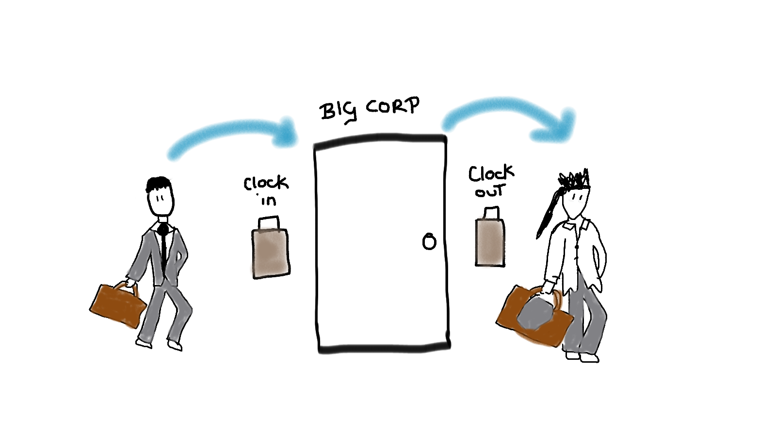
Analogy: a person clocking in and out of work. The time from when they clock in, to after they’ve done their work and clocked out.
This information tells us how long it is taking to process the work.
This may align to key performance indicators (KPIs) relating to the service or whether this is having a detrimental effect on service level agreements (SLAs). This metric can indicate where work might need to be done to address issues in the system. For example, it might be an API is slow in responding, but that is due to the downstream effects of this service taking a long time to do it’s job.
By itself, this metric is useful. In combination with saturation and error, it becomes even more valuable.
Saturation
In Brendan Gregg’s original definition he describes saturation as: “the degree to which the resource has extra work which it can’t service, often queued”.
This is where the definitions I use for service metrics diverges a bit. Here I use saturation to describe the degree to which work is queued, without considering resource.
This could be in a literal queue in the case of services - RabbitMQ, SQS or similar. There a couple of measures for this - the depth of queue, and the oldest message.
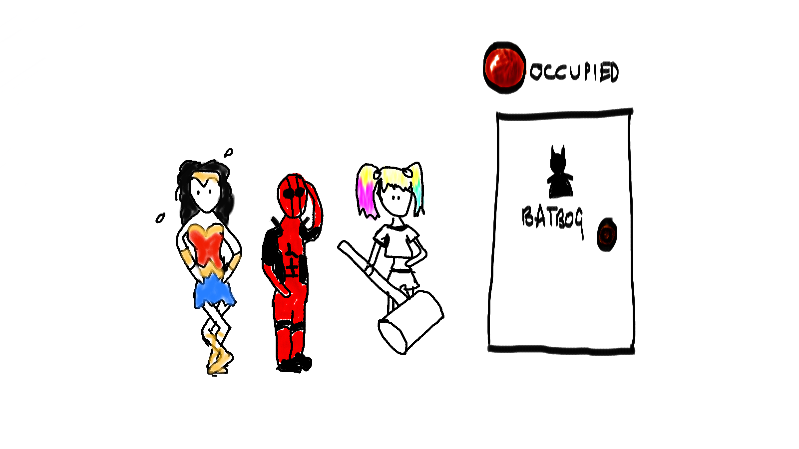
Analogy: When a toilet is occupied it can’t take on any more “work”. As such the queue gets longer outside. The degree to which the “toilet service” is saturated is the degree to which that queue builds up.
If the work being into your service is building up, there are a couple of problems that could be happening. It might be that your service cannot cope with the load and needs to be scaled. It might be that a change to the service has increased the utilisation time (see above) which has meant it can’t process the work as quickly.
As you have both utilisation and saturation metrics, you can use these to determine where you need to focus your diagnostic efforts in fixing the issues or improving the performance of your system.
Error
In Brendan Gregg’s original definition he describes saturation as: “the count of error events”.
For monitoring services, errors are pretty much what you would expect. When measuring errors, you need to consider the different types of errors (high level errors, internal errors, custom errors) the levels of error (fatal - warning) and the effect of these errors.
Without causing too much noise we need to measure these errors in a suitable way. If it is a fatal error, don’t just show it on a dashboard - alert on it. It needs an immediate response.

Analogy: Well… there’s no need for an analogy here…
For trying to determine if an error should be shown on a dashboard, I normally ask myself the following:
-
Can I stop this error from happening/being a problem?
-
Do I need to know if this error is aggregating/building up over a certain threshold over time?
-
Is this an internal error that may have an effect on the other two measurements, thereby providing context to where they are effected?
-
Is it a “diagnostic” error? If I can see something is going wrong at a higher level, it can probably be logged instead.
By addressing if the error should be shown on a dashboard, or should be visible through a different means of monitoring, I prevent my dashboards from being over crowded with information.
Errors aren’t just technical
Harking back at my previous posts - there aren’t just technical errors but also business concerns contextual to the service. The service is built for some business need and there may be behaviour which technically works, but is not desired behaviour for the businesses needs. These should be measured as well.
In the case of errors showing detriment to business requirement, these should be shown on the dashboard, and depending on effect, maybe should be alerted on.
Using these in combination
Together, these metrics are incredibly powerful.
Examples:
A slower utilisation and a higher saturation could point to a couple of causes. Maybe we have an increased load to our application and the service can’t cope with it. It might be that we need to scale or look into how we can improve the performance of the system. We would have to find out if there was an event that might have lead to this increase and if a short or long term fix would be required.
Another cause could just be the service is having issues. We should be able to see this from an increase in errors.
It might be that utilisation is still good but the saturation has increased. Here, we would scale as the problem doesn’t seem to be with the service itself, especially if there isn’t an increase in errors, and do some further investigations.
There are more combinations than those listed here, but over time you learn the patterns of unusual behaviour in your system and how to react. All from less than 5 baseline metrics.
Caveat
I’ve found these particular metrics very useful. Using them across teams as a general baseline makes it easier to move from one team to another and understand the state of their systems.
If these metrics aren’t already in place or if the information isn’t available, it can take a lot of time and effort to put in place. Needless to say, I think measuring metrics on visual dashboards alongside other forms of monitoring (alerts, diagnostics etc.) is an effective way of knowing the state of your systems and driving down the time to detect and respond to problems in them.
The introduction of working in this way without having the telemetry (measurements) in place is tricky in itself before taking into account the cultural change. For this to be effective you have to have the investment from your team, and preferably the company as a whole.
Hope this helps.
J.