A Practical Guide To Dashboarding Part One
The majority of us use dashboards and graphs in everyday life. From using modern banking apps like Monzo or Starling which display your spend rate graphically, to people managing their heating using an app. Using the scientific method of knowing about our environments, and measuring the effects of our actions is something that is becoming more second nature and common in our day-to-day. Some things we measure are variable, others less so. Some are complex, others are not. This gathering and easy interpretable display of information is something that a lot of people seem to find useful.
As technologists and business people, we work with complex systems and environments. We want to know the state of these systems. It’s useful to be able to see the effects of our actions and lack of actions. By having information about what is going on, we can find room to improve. As such, like with managing our budgets by monitoring with graphs and alerts using a banking app, we monitor the systems we are building and maintaining.
In previous posts, I’ve explored the use for dashboards and visualisations in measuring the state of our systems and businesses. I’ve talked about the social impact of dashboards as well as their usefulness and suggested ways in which to display information to a team in a way that ensures the information displayed is useful. I’ve also explored where the display of this information can be less useful and some reasons for why that might happen.
For this next series of posts, I would like to explore the idea of baselines. Can standardised baselines for certain informational dashboards have a positive impact? What baselines have been proposed for certain use cases and how they have worked in practice.
As with all my posts, this is all based on personal experience. I’m not saying it’s right or wrong, but it’s something I have found valuable and wish to share my thoughts on.
Let’s Chat Metrics
For the following posts, much like the previous chapter, I will be talking about metrics as opposed to diagnostics.
Metrics:
- Show a high-level overview of a system.
- Used for assessing a system and its current behaviour and spotting issues.
- Are often graphs kept in present view, such as the screens next to your development and operational teams.
Diagnostics:
- More often lower level. I.e. log analytics.
- Used for tracing and debugging uses
- Shorter lived and used for fixing uses.
Metrics are often used to guide diagnostics, but the use cases and scenarios are quite different.
I will not be covering any aspects of monitoring beyond dashboarding for this section either. There won’t be mention of patterns or baselines for logs or alerts for instance.
Learning from car dashboards
In previous posts, I’ve written about how the car dashboards are, in my opinion, one of the best designed visual displays of information. I’ve written about a couple of aspects of car dashboards we can adapt and learn from, to improve the visualisations we create to display the state of our systems - software, hardware, business or otherwise.
In previous posts we’ve covered the following suggestions:
- The information that is displayed should be clear.
When you first sit in a car and look at its dashboard, you know the big dial is the speedometer. You know this information is displayed in real-time and what that dial is showing. You know how to read the speed you are going at in real time.
This is the same for the majority of information on a car dashboard. You have an idea of where the information you need is displayed, how to interpret the way in which it is displayed and this doesn’t take much time or cognitive effort to figure out.
The information on any form of dashboard should be clear and unambiguous. It should be easy to work out what you are looking at and what it means.
- Information should be actionable.
There are a couple of aspects to this. Firstly, the information displayed on a car dashboard is the information you need in order to drive safely and keep the maintenance of the car up. There isn’t any information displayed that is for interest. Only information that is necessary and actionable.
Secondly, information is displayed in a way that the driver knows:
-
What the information means.
-
What action needs to be taken.
-
How quickly the situation needs to be reacted to.
-
The consequences if the information is not reacted to.
This helps with prioritising the actions to the information being provided. Speeding - you need to react quickly, you need to slow down if you don’t the consequences can be severe. If your indicator lights are on and you aren’t turning - you don’t need to react as quickly, you need to turn the indicator off, the consequences are less severe than speeding, but still not great.
When making dashboards and visualisations covering systems or businesses, the information displayed should be useful. There should be actions that can be applied if the state of what is measured changes. Even better if these actions are well documented/searchable. It is quite nice being on call when you know what you might need to look out for and that you will know what to do/where to find the information for what to do when something looks a bit troubling on a dashboard.
In my impactful dashboard talks I’ve also hinted upon:
- The urgency of the action should have an effect on how it’s displayed.
Again going back to the car dashboard, the speedometer needs to be reacted to quickly and therefore is the biggest dial on most car dashboards. The lights that mean your car needs some serious maintenance glow a threatening red. Based on the appearance and position of these signals and displays, a driver knows it’s urgency.
-
For dashboards at work, colour systems can be used:
- Green = Healthy
- Yellow = Might want to do some investigation into what’s going on/keep an eye on it
- Red = IT BROKE! FIX IT! NOW!
-
If there are two things that are likely to have an effect on each other - maybe you want to easily see information on both and how they are interacting easily.
-
When a team is working on a system, it’s likely to be less stable as it is being changed. This means there is a higher chance that there will be issues in this area while work is happening. Keep the visuals/dashboards covering that area of your system in line of site and on screens around the team.
-
It may also have an effect on how you monitor. Things that are very urgent or critical will most likely have alarms around them. If the behaviour isn’t necessarily dangerous or bad - it may be covered in logs rather than displayed on a dashboard.
All this is very contextual to what you might be working with. The overall idea is to change how things are monitored and displayed based on their urgency, but also their stability.
- Dashboards should be contextual
A car dashboard is demonstrating the current state of the car it is attached to. It is physically in context to the area it is measuring and displaying.
I personally like to do the same for dashboards for systems I work with. This might be demonstrating important stats per domain. It may be having all stats relating to an API in one place. If there is the appropriate tooling and time, it can be nice to have the ability to “click through the levels”. Have a feature level dashboard that you can dig into by clicking on metrics to find more about the domains underlying that feature, or the API’s, services and DB’s that are part of that domain.
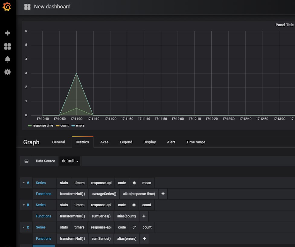
I have used Grafana a lot where I have worked. This has the functionality to click into metrics/linked boards. It also has the option to group by folder and a number of nice lockdown features around that. Add onto this, Grafana can take a number of data sources. This gave the option of having infrastructure and software metrics all within the same UI, making navigation between them easier. There are many ways in which to provide “context” to dashboards.
Part of this is also encouraging these metrics to be treated as first-class citizens. When working in a “context” that affects a dashboard, you are responsible for ensuring it is up to date and is displaying the information it should do. This helps with ensuring the stability of that system while it’s being worked on, but also means it’s everyone’s responsibility to keep the dashboards useful - because everyone benefits from having the knowledge they show.
There is another characteristic of car dashboards that I’d like to explore.
Car dashboards have a base level of information they always provide.
If you are familiar with cars, whether that’s as a driver, a passenger or otherwise, when you look at a car dashboard you know what the information displayed to you means very quickly. Cars do differ slightly on the design of their dashboards, but you know what the speedometer will look like and roughly where to look for it. It’s easy to find the oil gauge, the notification lights, the warning lights. No one needs to explain the dash to you, where to find the information you need, or what each dial and light is representing.
This is a powerful characteristic of car dashboards. There is a standard baseline of information. There is a standard way in which certain information is displayed. Because of this, it is easy to get the information you need when driving any car, even when there are slight differences in design.
What if we applied a similar idea to the dashboards and visualisations that tell us about the state of our software, infrastructure? It could be the case that by having standards for how we demonstrate information, we can make it easier to share information or work across teams. For example, a developer could go from one team to another and be able to understand the high-level state of the domain by looking at their dashboards, because API/service metrics are displayed the same way in the other teams they have worked in. Likewise, other teams and other technical departments would be able to interpret these boards easily, and without assistance, if needed.
Standardised Baselines
This is not a new idea. Personally, I have used baseline information in teams I have worked in. In infrastructure, it’s even more common. If you are using AWS or Azure, for example, they have in-built standards for monitoring certain things which you use.
In this series of posts, I will talk through baselines that I have tried and practised as a Software Developer. With reference to the original authors of these patterns, I’ll explain why the information is powerful and how it can be used.
I plan to only talk through APIs and services for now, as these are the areas I have the most experience in. There are similar standards out there for other areas of monitoring - front end, security, databases etc. If you are intrigued by the idea of having standards for dashboards, I encourage you to look into what is applicable for your needs and maybe send good resources my direction.
This set of talks is based on a talk I’ve recently presented at a few of the NDC Conferences - A Practical Guide To Dashboarding. It will go a little more in-depth, and I will share similar resources and maybe even record a couple of accompanying examples to go along with the posts. I have learnt a little more since the first presentation, as is always the way.
See the talk
You can watch the talk relating to this particular series here: